11th EAEA Envisioning Architecture: Design, Evaluation, Communication Conference in 2013
Track 2 | Experiential Simulation | The sensorY perception of the built environment
Visual ranges and landscape color assessments
Keywords: landscape color assessments; visual ranges
ABSTRACT
In generally, humans’ landscape assessments differ depending on visual ranges. However, whether visual range will have effects on humans’ landscape assessments was unknown in case of existing different colors in real environment. In this study, experiments were performed to quantitatively examine the effects on landscape assessment by considering three different visual ranges and many colors on building facade.
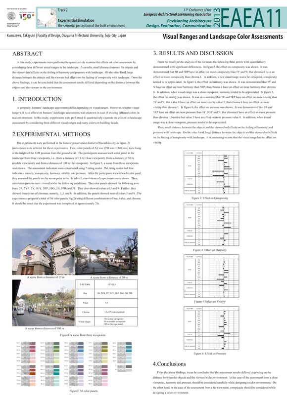
The experiments were performed in the historic preservation district of Kurashiki city in Japan. 21 participants were selected for these experiments. Simulation environments were built by making up some color boards on real building façade in the district. First, color panels of A1 size (594 mm × 840 mm) were hung at the height of the 13M position from the ground level. The participants assessed each color panel in the landscape from three viewpoints, i.e., from a distance of 25 m (close viewpoint), from a distance of 50 m (middle viewpoint), and from a distance of 100 m (far viewpoint). The assessment indicators were constructed using 7 rating scales The rating scales had four indicators, namely, conspicuity, harmony, vitality, and pressure . After the participants viewed each color panel, they assessed the landscape on the seven-point scale. Then, simulation patterns were created under the following conditions. The color panels showed the following nine hues: 5R, 5YR, 5Y, 5GY, 5RP, 5BG, 5B, 5PB, and 5P. They also showed values of 5 and 8. Further, they showed three types of chroma, namely, 1, 3, and 6. In addition, the panels showed neutral colors 5 and 8. The experimenter prepared a total of 56 color panels using different combinations of hue, value, and chroma. It should be noted that the experiment was completed in approximately 2 h.
From the results of the analysis of the variance, the following three points were quantitatively demonstrated with significant differences. Small distance between the objects and the viewers had effects on the feeling of harmony and pressure with landscape. On the other hand, large distance between the objects and the viewers had effects on the feeling of conspicuity with landscape. It is interesting to note that the visual range had no effect on vitality.
From the above findings, it can be concluded that the assessment results differed depending on the distance between the objects and the viewers in the environment. In the case of the assessment from a close viewpoint, harmony and pressure should be considered carefully while designing a color environment. On the other hand, in the case of the assessment from a far viewpoint, conspicuity should be considered while designing color environment.
AUTHOR
Takayuki Kumazawa
Faculty of Design, Okayama Prefectural University, Okayama, Japan